
Five Tweaks To Make Android Lollipop Even Better
Android Lollipop is an excellent leap forward for Google’s mobile operating system, but it isn’t perfect. Even with the Material Design overhaul and improved methods for working through tasks, it has a few annoyances that could use attention. So after some tinkering, here are five areas I think that it could use a touch up to make Android that much better.
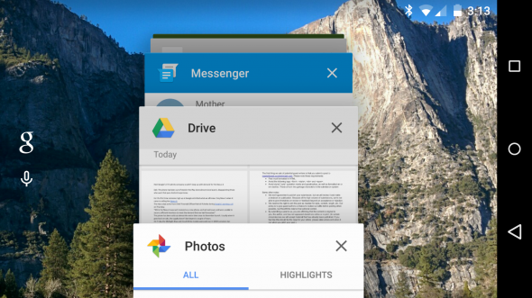
Multitasking tweaks
Overall I like the new multitasking layout, as the scrolled deck of cards makes it easy to spot the app that you are looking for. But that stack of cards can get cluttered rather quickly. Plus some apps, like Google Search and Gmail, break apart different tasks into their own cards.
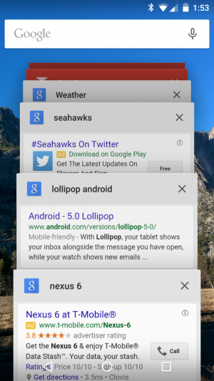
It can be convenient for getting back to a specific state within your app, but it clutters up the screen quickly. There needs to be a way for cards to drop off from the history after a while or a method for eliminating all the options from one app at once. I can’t speak to the memory management here, but I have to wonder if keeping all that information at the ready takes a bite out of the RAM.
Lose the Apple in the notifications
The new Android notifications look better, owing to a strict adherence to Material Design. But just like on iOS, they now get in the way. Sure, you can swipe it away, but then it’s gone. If you want to keep the icon around in the notification section so you don’t forget to address it, your only option is to wait for it to go away.
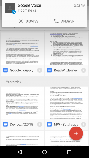
One fix could be when you swipe it away, you still keep the icon in the notifications section of the screen. Then it doesn’t disappear and you forget about it after doing so.
Change up the two-finger swipe for settings
The new settings drop-down menu is a big improvement over the last iteration. But when the device is unlocked it requires two swipes, a swipe and then a tap, or a two-finger swipe to get to details like the screen brightness, WiFi, Bluetooth, and other essentials.
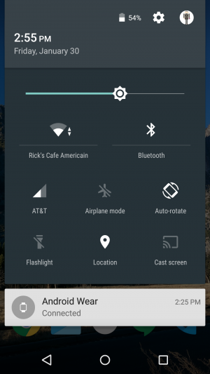
I’d like to see something more akin to how it used to work on an Android tablet – swiping a certain side of the screen brought you directly into the menu. Most Android screens are big enough to do this, and it would eliminate what can be a frustrating step.
Add some phablet features
Phones are getting bigger. No, not everything is like the Nexus 6, but five inches now is a regular size device, with those with 5.5-inch screens becoming increasingly popular. So Lollipop could use some ways to make maneuvering all these giant screens a little more pleasant.
Sure, there is the Reachability feature from the iPhone 6 Plus that Google could copy, but a true power feature would be some kind of split screen option. It exists in the Galaxy Note and other models, and would turn a large phone like the Note or the Nexus 6 into a more productive device.
Better Power menu options
Holding down the power button used to be an easy way to silence the phone, put it on vibrate, or switch to Airplane mode. Now it gives you just one option: turning it off.
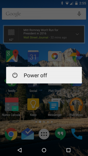
Yes, those options are still around – they’ve just been moved to other areas of the settings. But they were pretty convenient where they were at. It just seemed to make more sense to have them in that particular position. Google could just reverse course here and put them back.
You may also like...


![]() © 2024
© 2024
0 comments